SOCO Tahini
I was brought on as the lead designer to run a branding analysis for SOCO Tahini and implement my design recommendations to help increase their profits.
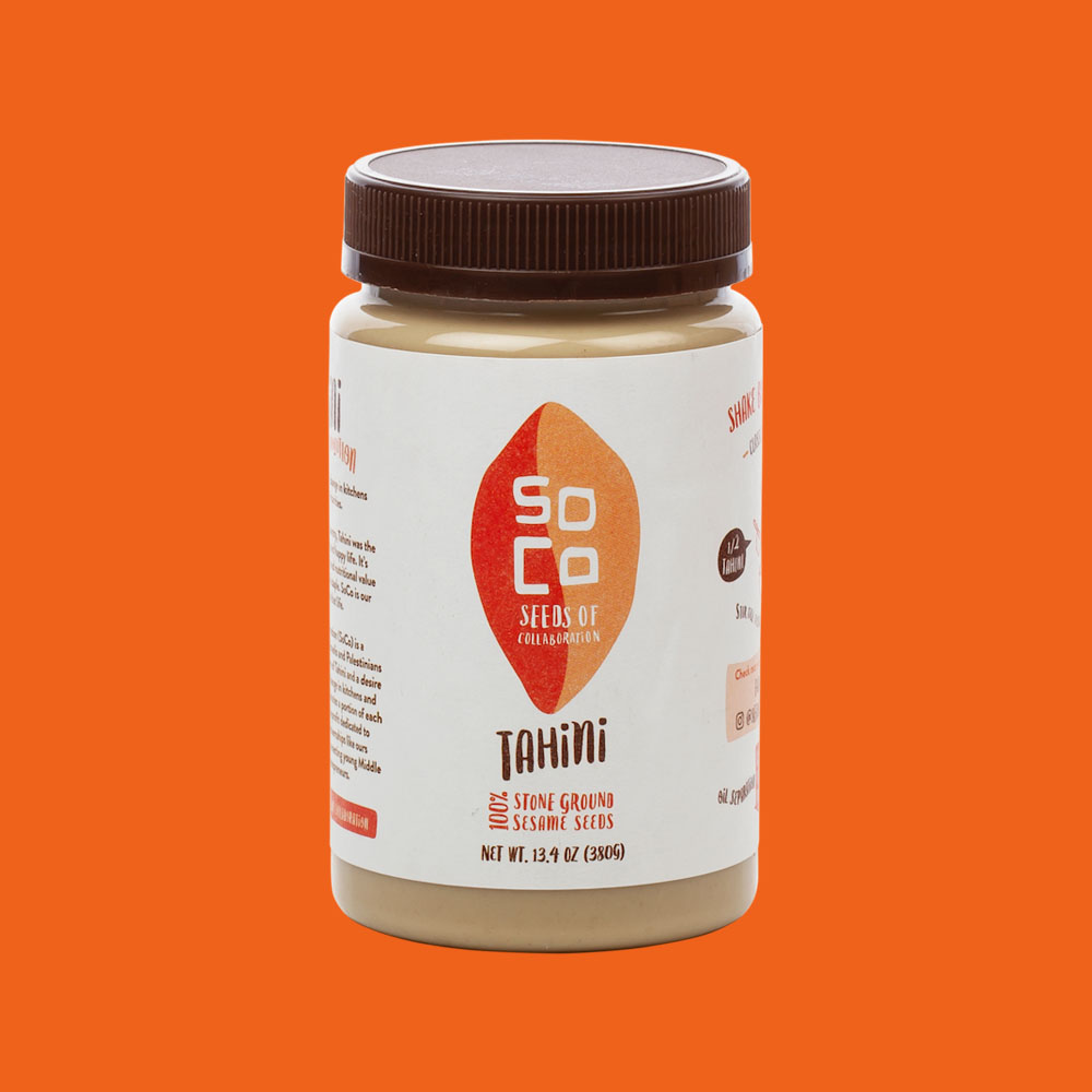
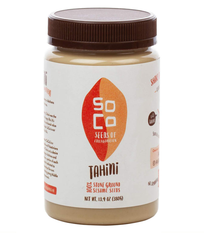
What I noticed about their current branding was that the colors were muted, blending into the color of the product as well as the packaging. On a grocery shelf, it would make it difficult for the product to stand out amongst competitors. I also noticed the word Tahini was very prominent and their logo got lost. The consumer will most likely already be looking for tahini when coming across their product. So I advised that building their brand awareness is most important.
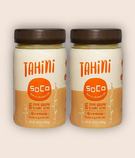
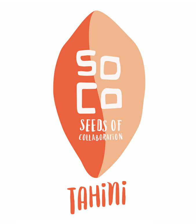
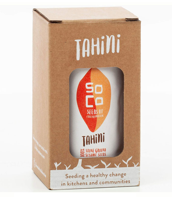
My overall changes were redesigning the logo and adding more color contrast to the label and packaging. For the logo, I wanted to play with the shape of a sesame seed and incorporate their mission of collaboration, having two colors intertwine. For the label, I made the background a creamy white to not only add contrast to the product itself but against its competitors. Lastly, I made the colors brighter and darker, increasing accessibility.
Here is an abbreviated visual version of my process.
Picture 1: The old branding. Picture 2: The new logo I designed. Picture 3: The new branding on the bottle. Picture 4: The full packaging.
.
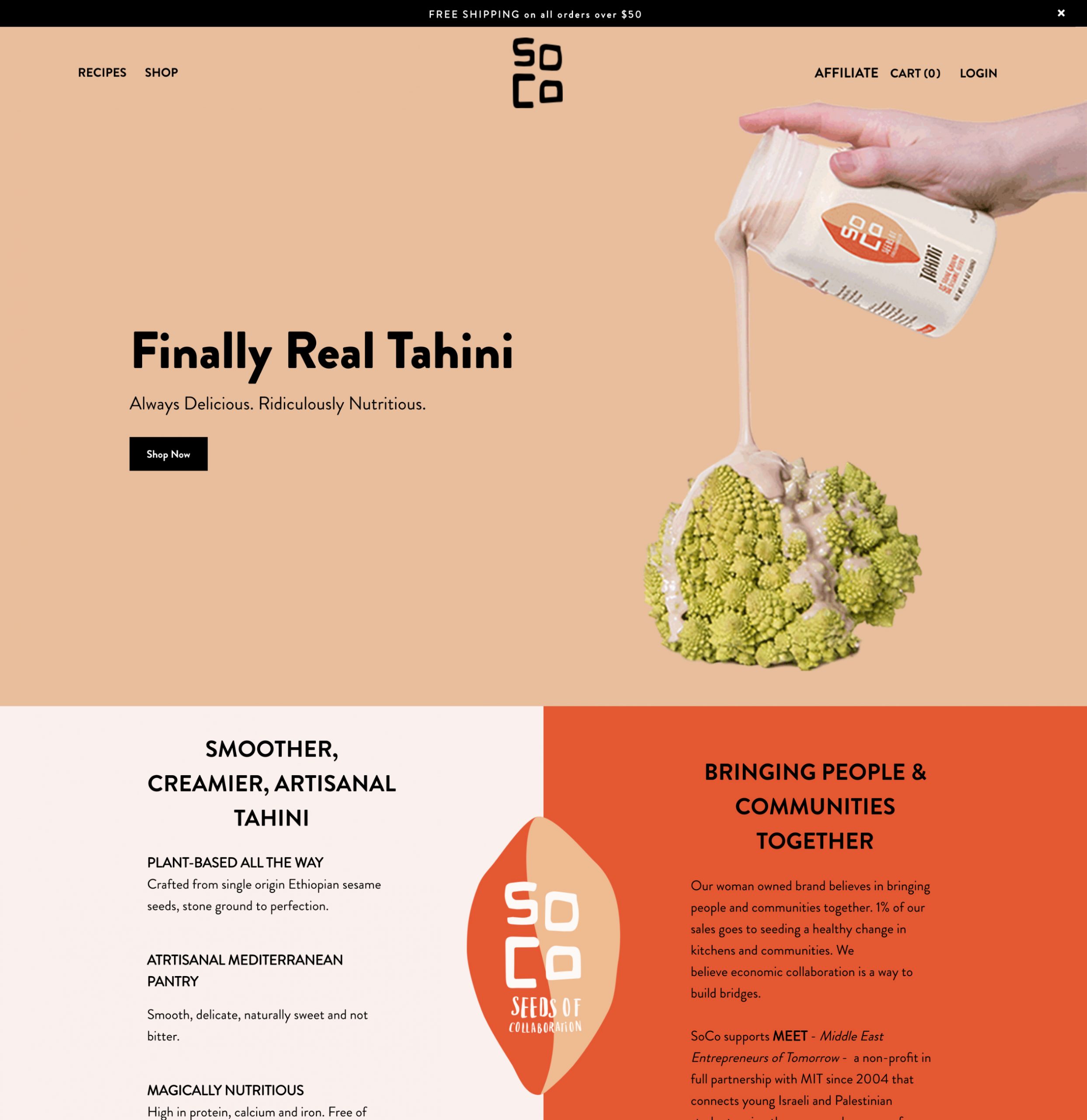
Below: How the branding was implemented on the website.