Smithsonian Magazine Website Design
1. Overview
About
Smithsonian magazine places a Smithsonian lens on the world, looking at the topics and subject matters researched, studied and exhibited by the Smithsonian Institution—science, history, art, popular culture and innovation. The magazine is highly regarded as an icon to American culture. It’s first publication was in 1970. This specific project was for the web product only.
The Challenge
The Smithsonian magazine website publishes content from both the print magazine as well as exclusive digital content. It also showcases other businesses from its parent company Smithsonian Enterprises. The current design was causing brand confusion. There was also a distracting advertising experience, which was effecting user engagement. The challenge was to use design to create a better user experience without losing revenue.
My Role
Designer | Director | Manager
- Set timeline and managed project
- Ran brainstorming sessions with the editorial, revenue, and executive teams
- Ran user interviews
- Directed the design direction and created all of the designs
- Managed design to dev handoff
- Ran design QA
2. User Research & Discovery
The first step was to conduct user research to gain insights into the pain points and expectations of Grid’s target audience. This involved a combination of surveys, interviews, and usability testing with current users. We also did a deep dive into our competitors and our own user data. This data provided essential insights into our users and where the current design was falling short.
Interviews
We conducted one on one interviews through zoom as well as by phone with emailed questions. It was the users choice to decide their preference.
Competitor Analysis
We ran an in-depth analysis of other magazine websites. I met with stakeholders to review data and compare trends, features and patterns.
Data
Worked with our marketing team in creating a data report on our current users. I also ran multiple heatmap tests over two months to analyze user patterns.
Goals
After analyzing our user research and data and meeting with key stakeholders and c-suite executives, we set the following three goals.
Increase revenue opportunities
With the original design, there was a lot of competing real estate on the site. This included the other revenue companies of the Smithsonian Enterprises parent company as well as advertising and native advertising opportunities. From our research, we found that this was causing brand confusion from our readers. Through design, I believed we could create better brand cohesion and increase opportunities for both our parent company and the advertising sales team.
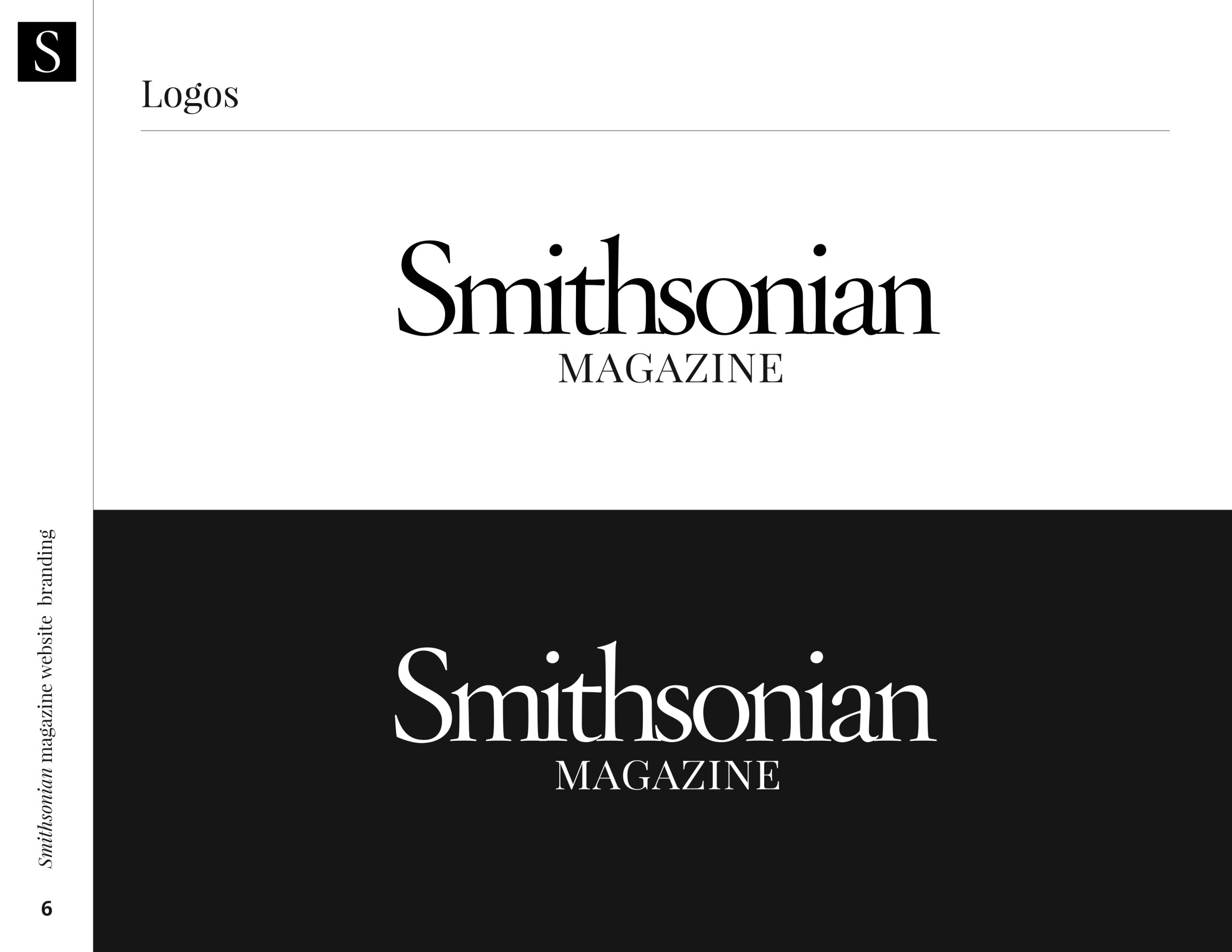
Update the visual identity
The original design of the website was very different than its partner print product. Through our research, we found that this was a point of confusion for our readers. In addition to the inconsistency amongst the print and digital products, there were inconsistencies with the other Smithsonian Enterprises brands being advertised on the site. One goal of the redesign became to create brand cohesion amongst all brands.
Increase User Engagement
Our data analysis showed a higher than desired bounce rate and lower than desired time on site. In addition to creating a general better user experience, we wanted to strategically increase the way users could find and further engage with content on our site.
3. Visual Identity
Before starting on the redesign of the website, we needed to explore the visual identity to improve the brand cohesion between the print and digital products. I organized brainstorms with the Art Director of the print magazine as well as studied the current styling of both products. One major consideration was that the audiences for the print and digital products were different, so a design challenge was to create a style that effectively spoke to both as well as was reflective of the historic brand. After a couple of rounds, I was able to design a concept that spoke to our audience and satisfied internal goals.
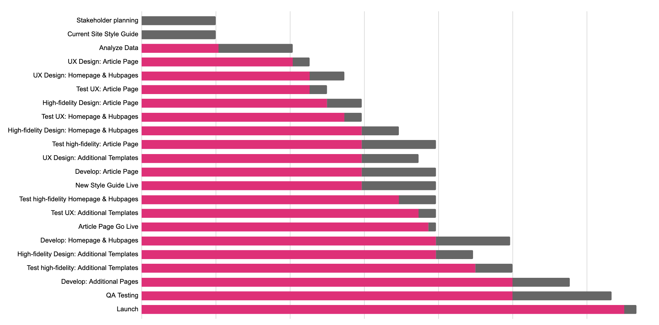
4. Sitemapping and planning
Before jumping into any sketching or prototyping, I had to organize a sitemap. I met with the editorial team and other key stakeholders to discuss any pages we were archiving and if there was also any new formats we wanted to create. This strategic planning enabled the precise identification of template types and quantities, ultimately leading to the formulation of a well-grounded and achievable project timeline.
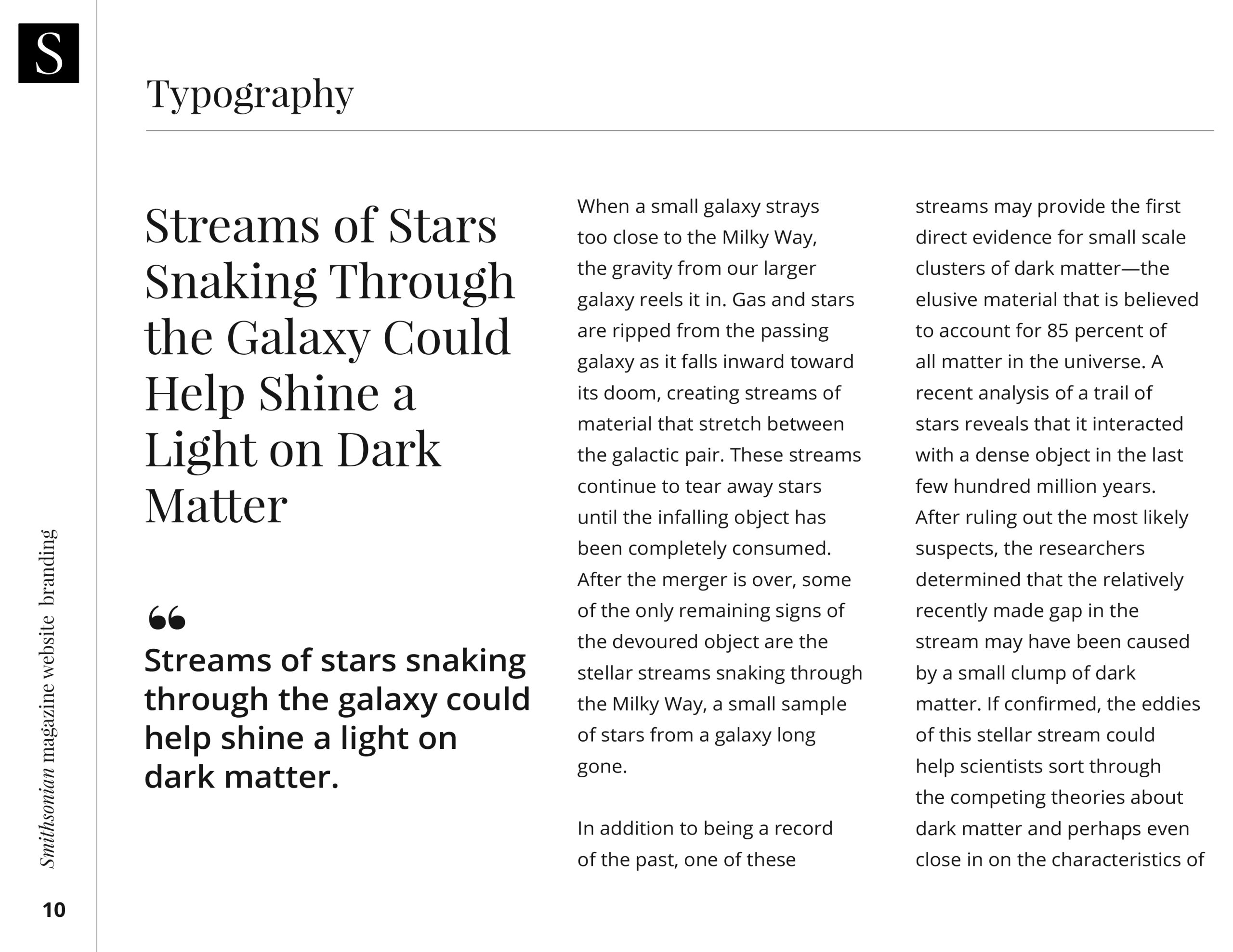
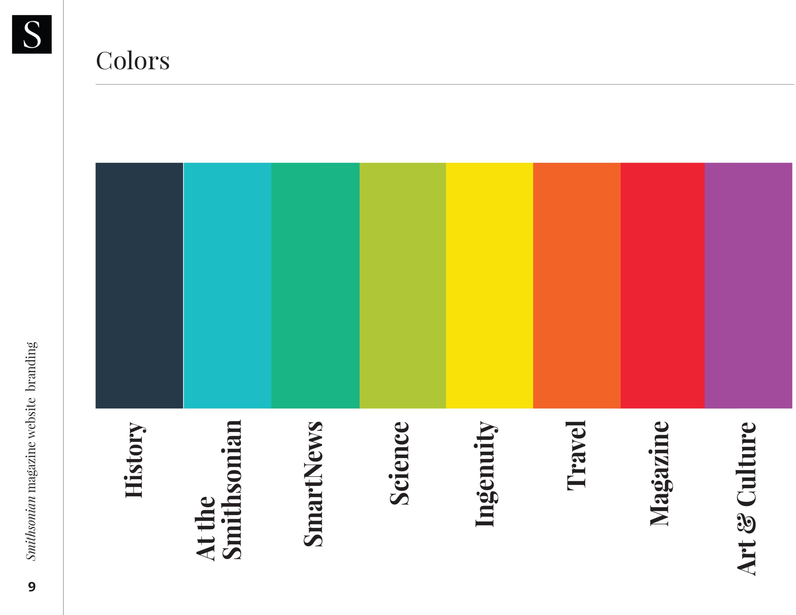
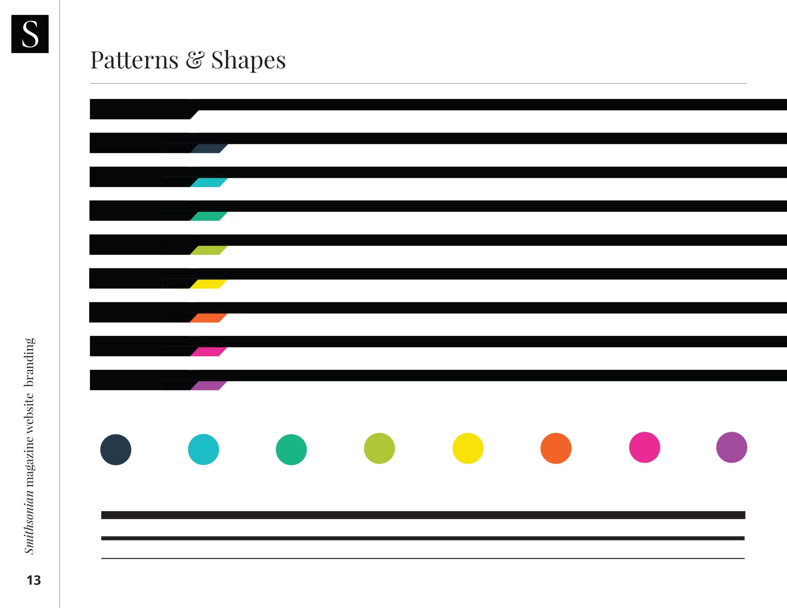
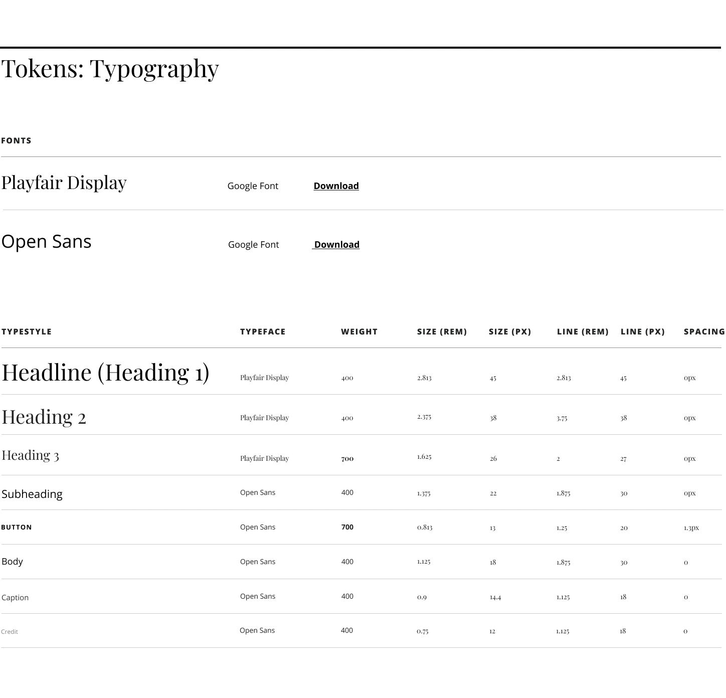
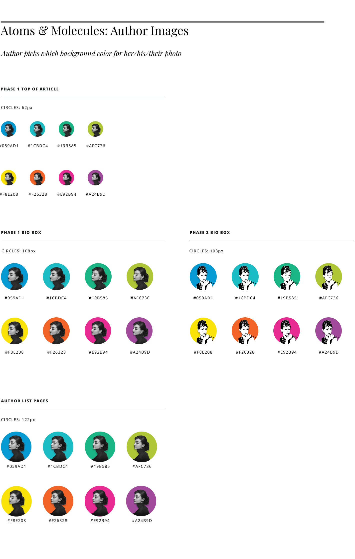
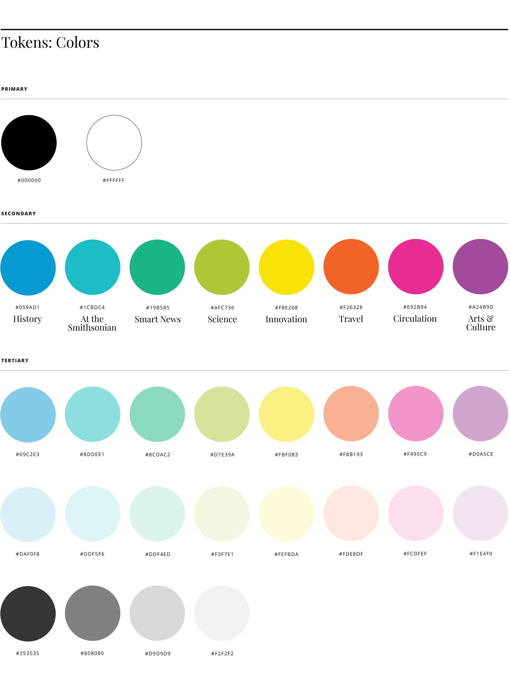
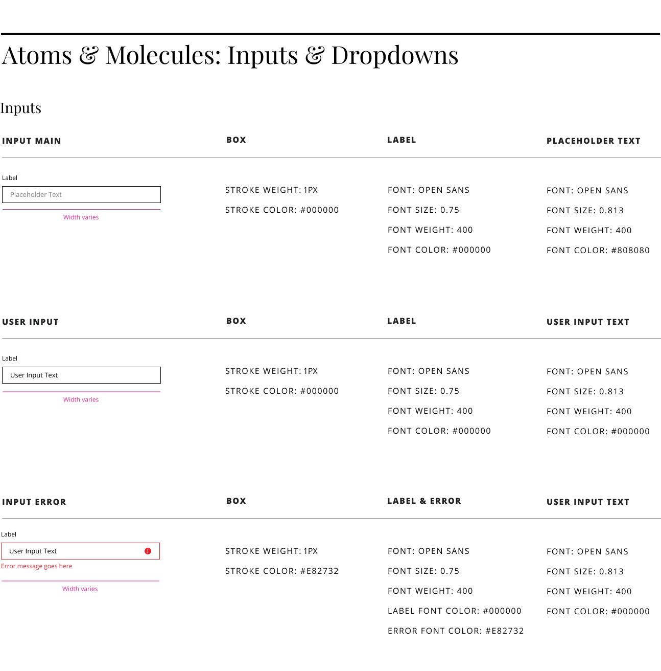
5. Design System
Once we had buy-in and approval from key stakeholders on the visual identity, I worked on translating that into Smithsonian’s first design system.
6. Wireframing
Following a comprehensive examination of our existing page designs, coupled with an in-depth review of our objectives and stakeholder feedback, I transitioned my attention toward user experience enhancement. This marked the initiation of the wireframing phase.
With an unwavering commitment to refining the user journey, I delved into crafting wireframes that encapsulated our three goals. This involved thoughtfully mapping out the placement of key elements, such as navigation menus, content blocks, and interactive features, with a meticulous focus on ensuring intuitive usability and alignment with our overarching goals.
After analyzing the data for each template, I identified the article page as the most important being that it covered over 80% of traffic and the biggest opportunity for further engagement.
7. UI Design
8. Final Conclusions & Reflections
After launching the new site, we saw an increase in time on site on average for our users. We also saw more clicks per user, so there was an overall increase in engagement.
The website’s design garnered acclaim, fostering enhanced brand alignment across both print and digital products, as well as other Smithsonian Enterprises endeavors. This achievement culminated in the prestigious accolade of winning the 2022 People’s Choice Webby Award for the best magazine site.